Part II: Illustrate the look and feel of your app.
Thanks to the right keywords and categories, you have successfully led your customers to the app. Now what counts is the first impression. In part II of our ASO tips, we will show you how to impress users with informative screenshots and well-designed preview videos.
The app icon/logo
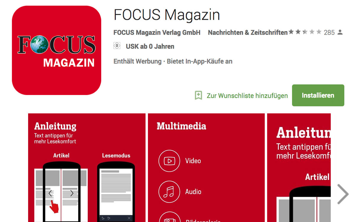
The app icon plays an essential role. As a permanently visible symbol on the smartphone display, it is your digital entrance-ticket to the user’s daily life. To constantly encourage the user to use the app and to do so in a variety of situations, the app icon must have a high product-recognition factor. The benefits and the intrinsic value of the app must be directly reflected in the icon. A practical example: The magazine icon of ‘Natürlich gesund und munter’ – naturally healthy and happy – is a white leaf on a dark green background. The promise of a healthy, natural lifestyle, which the magazine promotes with advice and tips, is already apparent in the logo.
Graphical aspects should also be considered with the icon or logo: do not use photo portraits, detailed representations, or longer words, because these are difficult to recognize later on a display. The logo should work as a small icon image as well as in higher resolution on posters.

reflect the content again and visually stand out on the smartphone display.
Screenshots as preview images
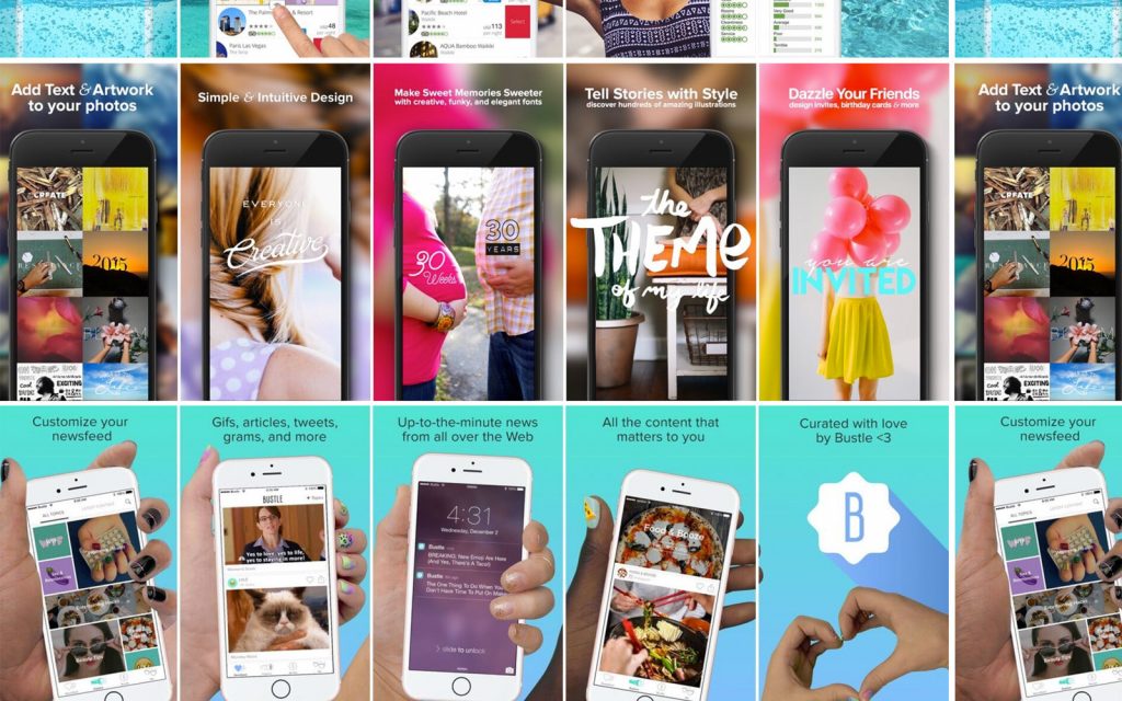
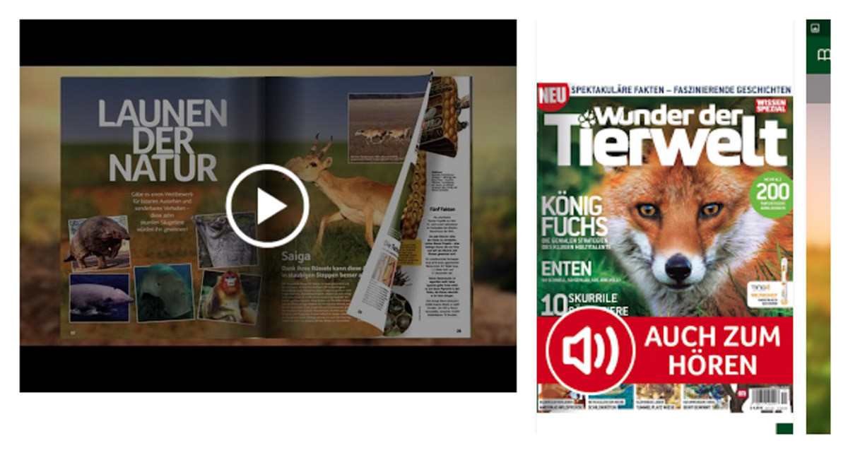
The user gains their first impression of the app through the preview images and screenshots. These must be striking, stimulating and informative if they are to convince the user to download. Don’t use simple screenshots showing different perspectives of the app. Explain images with additional captions, text, and graphics and embed the screenshots in suitable backgrounds. This gives the user a sense of where and when they can use the app, e.g. road-traffic scenes for a navigation app; for language learning, beautiful locations in a country where the language is spoken. You don’t have to rush straight to your graphic artist to spice up your screenshots – great tools and screenshot builders are also Screenshot-Builder available on the web.
In the Apple App Store, for each type of device you can add five preview images; in the Google Play Store this goes up to eight screenshots. Make the most of this – anything else is a wasted opportunity to reach your customers.
In both stores the first one and a half screenshots are displayed. You can determine the order of the images yourself, and you should use these to illustrate navigation through the app or ideal app usage. The images can thereby reflect the functions and the added value outlined in the description and contained in the keywords.
Storytelling on the app store with preview videos
In both stores, instead of screenshots, videos can be integrated to playfully explain the functions and use of your app. Videos speak to the user at an emotional level, placing them directly in a specific usage situation or location. Use background music, voice-overs or animations. Keep in mind that the app video must work without sound. When necessary, integrate subtitles, or show in a real exemplary case how the app is used. Regardless of what variation you choose, it is worth writing a short script in advance, in which all scenes, settings and texts are noted down.
In the Apple App Store, you have the option to upload your own video with a maximum length of 30 seconds. You can also upload different videos in other languages for the various parts of the world where your app is offered.
A YouTube link can be integrated into the Google Play Store, which means the duration of the video is not limited. To avoid giving users unnecessary information and thus losing their attention, limit the length of the video to 60 seconds.
Feature graphics – only in Google Play Store
In terms of usability, Apple often has the edge. However, when it comes to app stores, the Google Play Store offers a larger digital playing field. The videos in the Google Store allow more content and additional animations than the Apple App Store.
Google also allows you to integrate another graphic or a video into the header of the app store page: the feature graphics. The space is ideal for referencing your company or magazine, for instance with the company logo or the latest edition’s cover. Alternatively you can place ads or promotion videos here.
And finally: After the app download is before the (next) app download. The app store users themselves reveal what ought to be considered in descriptions, keywords and, of course, concerning the app itself.
Customer reviews – your guide to the reader
Having downloaded your app, users can rate and comment on it with a 5-star rating system. This rating, which is prominently placed in the Google Play Store, is not unimportant for first impressions and for finding the app. To encourage as many users as possible to evaluate the app, you can interactively integrate a review request. This saves users the long journey round the store. Make a call for app ratings on the web and social media. Use vouchers or prize-games to create incentive and motivation for the user.
In addition to quantity, the quality of the evaluations is crucial. User comments provide you with an inexhaustible pool of feedback. Through a personal response to your readers’ questions, criticism and praise, the readers feel taken seriously and this strengthens customer loyalty. For queries on app features or subscription models, refer the reader to explanatory videos or the Help Center. If the customer has a suggestion, look into it and thank them for the feedback. Every criticism and every compliment is a basis for optimizing your app and the content and adapting to customer requirements. In addition, customer ratings provide good ideas for keywords and can help anticipate future trends.
Conclusion
There are many opportunities, with both text and graphical elements, to effectively advertise and present your app in the stores. Use these and experiment! Exchange keywords and alter images and description text to increase the download count. This provides Apple and Google with a constant feed of new material, which helps their search engines find you and ensures a better ranking.
You’ll see – ASO, like your website, is a steady process that requires some work, but thanks to some tools and integrated app functions, it is quickly incorporated into the usual marketing processes. Get started and get creative!