Part I: Finding the right words to find the app
With posters and stand-up displays in newsagents and station bookstores, marketing staff and graphic artists are giving it their all to win over new customers. But meanwhile the digital window-display is often neglected: the app store.
With tips and tricks from App Store Optimization we will show you how your app can make a winning appearance at the store. This translates as greater visibility of your magazine app, higher download counts and more reach.
In this part we deal with the planning and the description in the app stores.
Solid as a rock: your marketing strategy
The basis of the ASO is your existing marketing strategy, where marketing goals, target group, market analysis and the main topics of your magazine or the company’s guiding principles have already been defined. These provide inspiration and ideas for the description and layout of your app. To make things easier, this strategy can be somewhat refined in advance.
The goal of the ASO strategy will already be familiar to many: to increase the average time on site, promote the sale of single issues, or to convince users to download the app. But who are the users? An app allows you to reach new and young target groups in addition to existing readers. In order to really get through to such potential customers, consider first who exactly will benefit from the app and your magazine’s themes. Or to put it differently, whose problem is it that you are trying to solve (digitally)? Use such questions to put yourself in the shoes of the new target group and understand how users search for your app.
The app name
A good app name and the appropriate categories are crucial to making the search for your app in the store as simple as possible. Choose a name for your app which is memorable, comprehensible and as short as possible. From the 30 characters available in the iOS store and the 50 characters on Google Play, only 20 characters are displayed on mobile devices. With Apple, you also have the option to specify your app, magazine, or company in the subtitle with 30 characters.
The name should either have a direct reference to the magazine or to the features of the app. Include a concise keyword in the app name

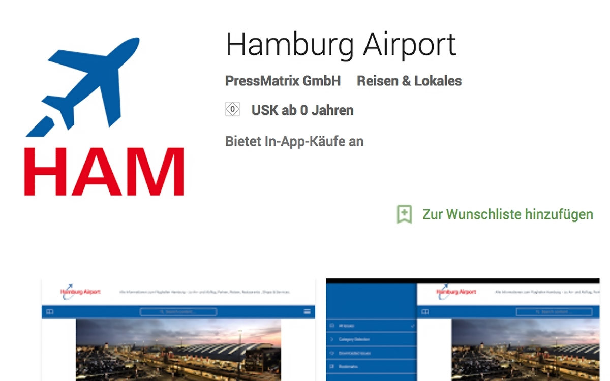
the Hamburg Airport-App.
Categories in the App Store
To find an app suited to a specific topic or problem, users also use the app stores’ prescribed categories. In the Apple Store you can find two categories; in the Google Play Store, one eand can choose the type of app (application, game, etc.) from a long, prescribed list. The success of individual categories can be found in several statistics.
If possible, do not fall back on the most popular and frequently used categories. After all, you want to stand out from the crowd with your magazine and app.
App found? It’s time to convince the customer!
Once the user has found the app in the store, you have several opportunities to win them over with keywords, app descriptions and an appropriate app layout. To promote your app to the Top 100 app list, you need to choose a search-engine-friendly description. This shouldn’t be too difficult – after all, search machines are attracted to readable, user-optimized texts.
Keywords and description in the Apple Store
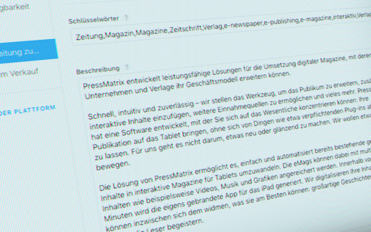
In the Apple App Store, keywords can be individually specified to make it easier for Apple to classify your app and for user searches to find you. So choose the 100 characters as skilfully as possible. As with Google-search, it is worth determining what terms and phrases concerning your magazine are searched for most. Many will be familiar with a similar process from website optimization and Google AdWords.
Along with the keywords, starting from iOS 11, you can also add a short advertising text of up to 170 characters. This can be updated at any time and is ideal for communicating information on app updates, events, trial subscriptions and other news.
The most comprehensive part and the heart of your app’s store-page is the app description. Here Apple gives you 4,000 characters to introduce your app. For a useful description, it is worth recalling and ennumerating the added value of the app, the problems it solves and the issues that are addressed. Don’t play keyword bingo; concentrate on simple clear formulation. Due to the limited presentation space on mobile devices, important info should be given in the first two to three lines.

App description in Google Play Store
In the most popular Android store, textual skills are required. Unlike iOS, there are only 3,000 characters, with no additional subtitles or advertising to help present your app in the best light.
Further, the keywords that allow you to classify your app are automatically generated by Google Play Store from the description text and cannot be entered independently. This means the most important terms should appear three to five times in the description text. This is the only way for Google to recognize the appropriate keywords.
Here, too, the functions and contents of your app and the added value for the user must be highlighted. The first 800 characters of the description are always displayed; the user only sees the other 2,200 if they select “learn more”. For this store in particular, a pre-search of important and popular terms with a Keyword-Planner from Google or another provider is highly recommended.
Intermediate Conclusion
As you can see, the textual passages already present opportunities to convince users that your app is their app. Important here is to vary the keywords and test them against each other – a process that may be familiar to you from your website and call-to-actions. Use all available text fields and update regularly with info on changes and the latest innovations.
Do not miss: In the second part, we give you tips and hints on the layout of your App Store page.

